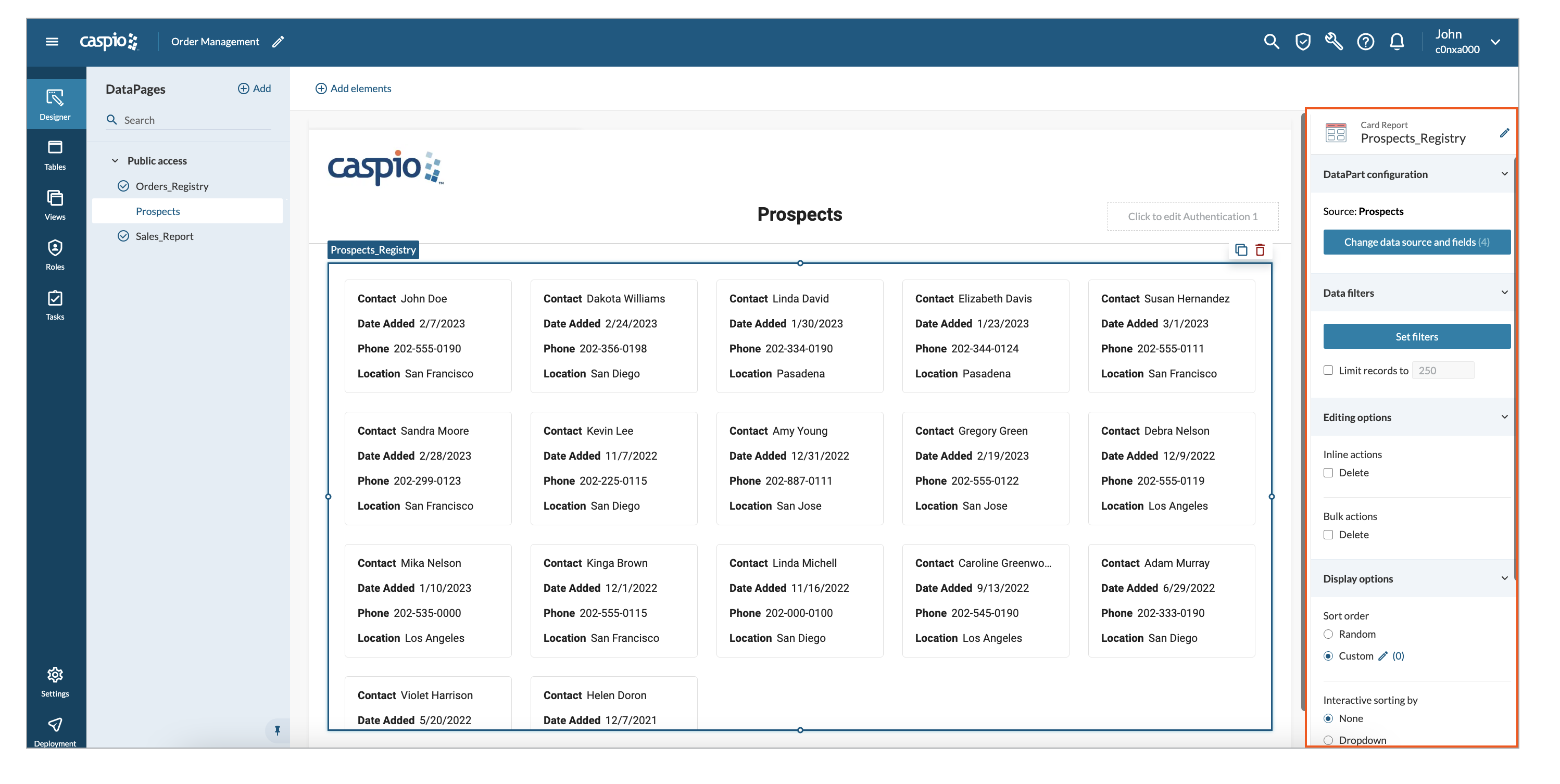
A Card Report displays the records in a card grid of multiple rows and columns. Card Reports work best for showing small snippets of data in a flexible card format. For instance, as a sales manager, you can view all your sales prospects. 

Steps to create Card Reports  

  1. Select the fields you want to include in the report:
    1. In the upper panel, click the Add elements button.  
    2. Select ReportsCard.
    3. In the Data source panel, select a table or view that will be the primary data source for your DataPart.  
    4. From the Available fields panel, select the fields you want to use in your app. To do that, click the field or drag and drop it into the Selected fields section. You can bulk-add all the fields by clicking the Select all button.
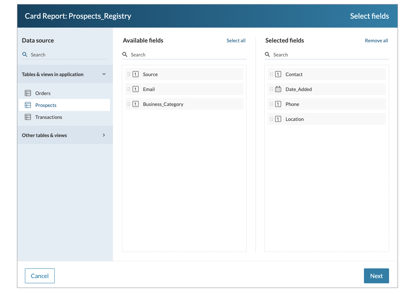
    5. Click Next. 
  2. Configure the report fields: 
    1. Optional: If you want to add customizable HTML content for descriptive text, links, or graphics to the DataPage, in the Elements panel, click Add > HTML block and edit the code.
      You can format the content in the visual editor or enter your custom code. HTML block supports data source parameters, authenticated user fields, system parameters, and app parameters.
    2. In the Elements panel, select a field that should be displayed in a report. You can also rearrange the order of fields using drag and drop. 
    3. Provide a label for a field column. 
    4. Select Create. 

After creating a Card Report, you can modify it by applying additional configurations. Learn more.

Note: You can restrict the visibility of specific records in a report by managing role permissions. Learn more.

Configuring additional options for a Card Report 

After creating a Card Report, in the right panel, you can configure additional options of a DataPart. The following configurations are available: 

DataPart configuration

Data filters

Editing

Display

Sorting

DataPart configuration  

Select DataPart configuration to edit the data source and its fields. This option may be helpful when you want to add or remove fields from a data source or change a data source to a different table or view. 

Data filters  

Select Data filters to set up criteria for DataPart filtering. Learn more.

In the Limits records to section, you can specify the number of records matching the filtering criteria that should be displayed in a report. 

Editing 

Select Editing options to enable inline and bulk deletes.  

  • Inline actions allow a user with adequate access permissions to delete each record directly from the results page. 
  • Bulk Delete allows a user with adequate permissions to select any number of displayed records and delete them with one click. 

Display 

Use the Display Options section to configure the sort order of the results, number of records per page and displaying record index.  

Sort order 

Sort order defines how records from data source should appear in Card Report DataPart. The following options are available:  

  • Random – records are displayed in random order. 
  • Custom – records are displayed in the set order.  

To customize the sort order, select Custom and click the pen icon. Then, click the fields in the Available fields section or drag and drop them into the Sorting fields section. 

Interactive sorting by 

Interactive sorting by allows the app users to define how records from data source should appear in Tabular Report DataPart. The following options are available:  

  • None – disables interactive sorting.  
  • Dropdown – predefined choice of sorting presented in a dropdown at the top of the report.  

To configure dropdown sorting, select Dropdown to open the configuration options.  

In the General tab: 

  1. Define the label and placeholder text for a dropdown option.  
  2. Select the Add new sorting field button to add a sorting field. 
  3. Specify the sorting direction and the label for a dropdown option.  
  4. Select Finish. 

In the Layout tab: 

  1. Define the dropdown size:  
    • Auto – defines the width of a column by the size of the content inside a field,  
    • Fixed – allows for setting the precise size of the column field width in pixels [1-9999px]. The content of a field will not be visible if it exceeds the set size. 
  1. Define the label position: left, top, float, or no label. 
  2. Select Finish. 

Records per page 

With Records per page, you can specify the number of records that should be displayed on each page. You can display between 1 and 1000 records per page. 

You can also show the number of records at the bottom of a report with Show record count. 

Cards grid 

With the Cards grid option, you can set the number of columns displayed in a report. There are two options available: Auto and Fixed. 

For the Auto option, the number of columns is calculated based on the minimal card size width and the size of the whole DataPart set in Designer Canvas. It means that the size of cards adjusts to the available space in a DataPart. 

For the Fixed option, the number of columns is always the same and the cards adjust to the size of the whole DataPart.  

Note: The card width input must be between 80px and 9999px. 

Sorting options

If you want to sort data by default, in the Default sorting section, select one of the options:

  • To sort the report based on field values, select By field, and then add and arrange the sorting fields.
  • To sort the report in an arbitrary manner, select Random.

If you want to allow app users to sort the report based on field values, in the Sorting options for app users section, turn on the Sort via dropdown toggle to display a dropdown with a list of fields available for sorting.
By default, all the fields included in the report and the Default sorting option are displayed in the dropdown. You can customize the dropdown list by adding, removing, and rearranging the options.