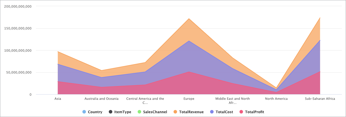
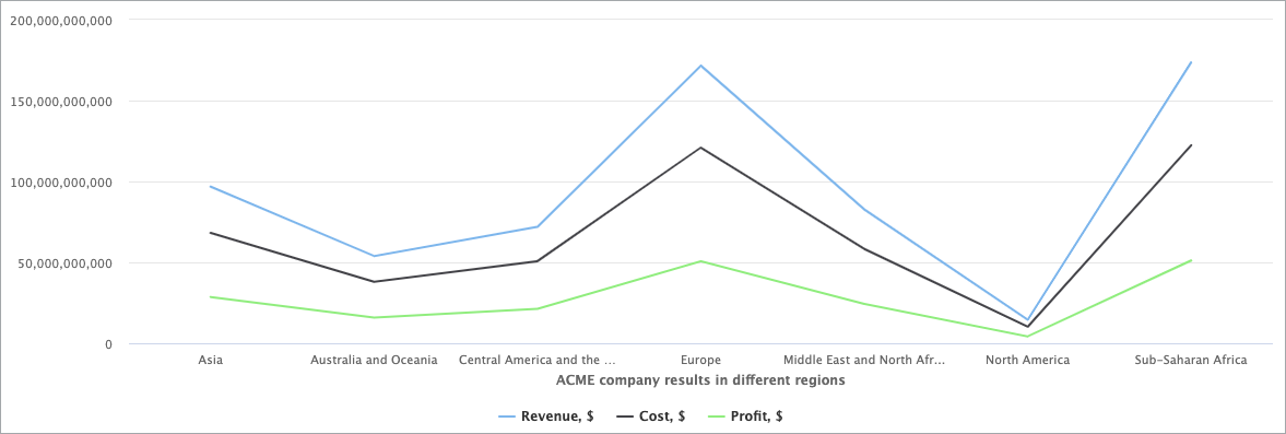
You can use the Area Chart DataPart particularly when you want to show changes over time or compare multiple categories. Area charts are similar to line charts, but with the area below the line filled in, which can help emphasize the magnitude of the data.
For example, an Area Chart can show financial metrics such as revenue, profits, and expenses over time. This information can help identify areas where you can reduce costs or increase revenue.
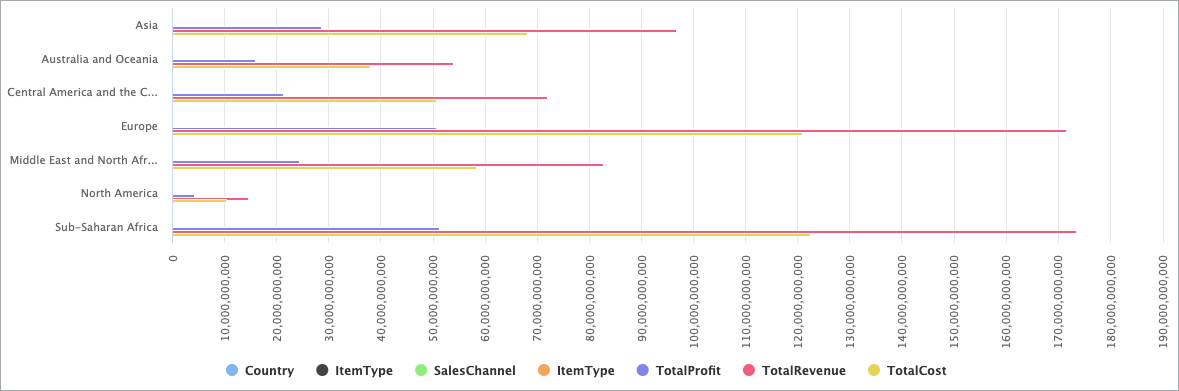
The Bar Chart DataPart is useful when you want to visually compare different values or categories. Bar Charts can quickly provide a clear understanding of how different values compare to one another, making them an effective way to communicate information to a wide audience.
For example, you can use a Bar Chart to present data on the number of customers who bought specific items in your online store. This can allow you to easily see which items are most popular and which ones may need more promotion or development.
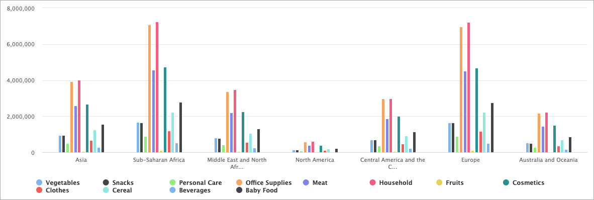
The Column Chart DataPart works best when you need to analyze complex data and find answers to the questions about data in a visual analysis. A Column Chart makes complicated data easy to understand as it highlights the largest or smallest number in the set of data and shows relationships between values.
For instance, with a Column Chart, you can show how much money a small business spends by expense type, or how many different items each department sold within a store across a consistent interval of time.
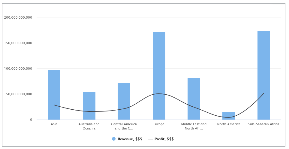
Use the Combination Chart DataPart when you want to visually highlight differences between sets of data and make it easy to see the relationship between sets of data. This way, you can communicate data shape more than the value of categorical data.
For example, you can create a Combination Chart that incorporates both a column chart and a line graph. The chart visualizes the dollar value of goods sales across multiple stores using columns, while simultaneously indicating the profit generated by each product through a line.
Use the Line Chart DataPart when you want to display how data changes over time. This way, you can visualize trends and patterns in user behavior, system performance, and other important metrics.
For example, you can use Line Charts to track user activity over time, such as the number of users who logged in, the number of messages that they sent, or the number of purchases that they made. By looking at the trends in user activity over time, you can identify when they are most active, and adjust your application and business strategy accordingly.
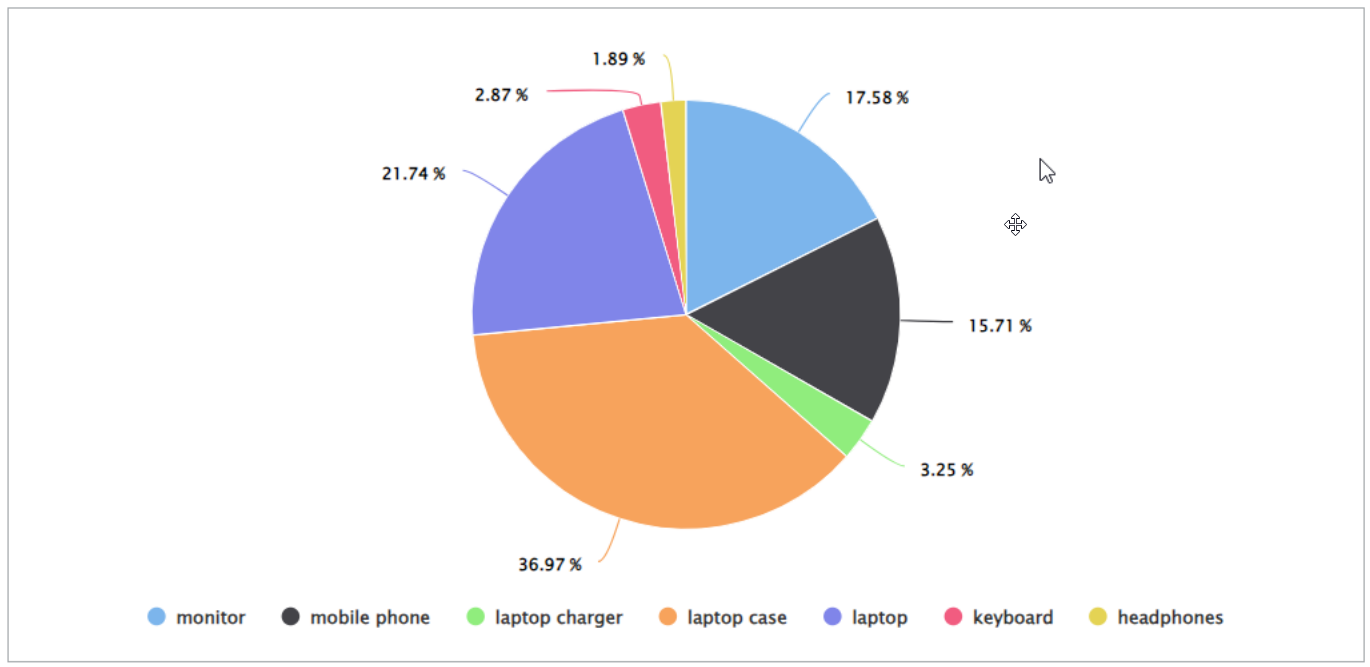
Use Pie Charts to visually present the percentage distribution of your data.
For example, you can show profits generated per country, or revenue from different products.